Purpose
The purpose of this Quick Reference Guide (QRG) is to provide a step-by-step guide of how to add visualization in the Oracle Analytics Cloud (OAC) DV.
Introduction and Overview
This QRG covers the process of adding visualization in OAC DV. Users can quickly create and customize interactive charts, graphs, and dashboards, transforming raw data into clear and actionable visual insights. Following these steps helps users present information more effectively, discover key trends, and drive data-based decisions within their agency or organization.
Adding Visualization in OAC DV
Follow the below steps to add visualization in OAC DV. There are 17 steps to complete this process.
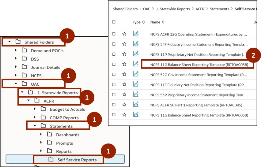
Step 1. Navigate to the Shared Folders, then open the OAC folder. In the OAC folder, click Statewide Reports and select ACFR. In the ACFR folder, click Statements, then click Self Service Reports.
Step 2. A list of DV templates is displayed within the selected report type. Double-click NCFS 11G - Balance Sheet Reporting Template (RPTOAC038) report.
Step 3. Once the report is open, click the Edit icon.
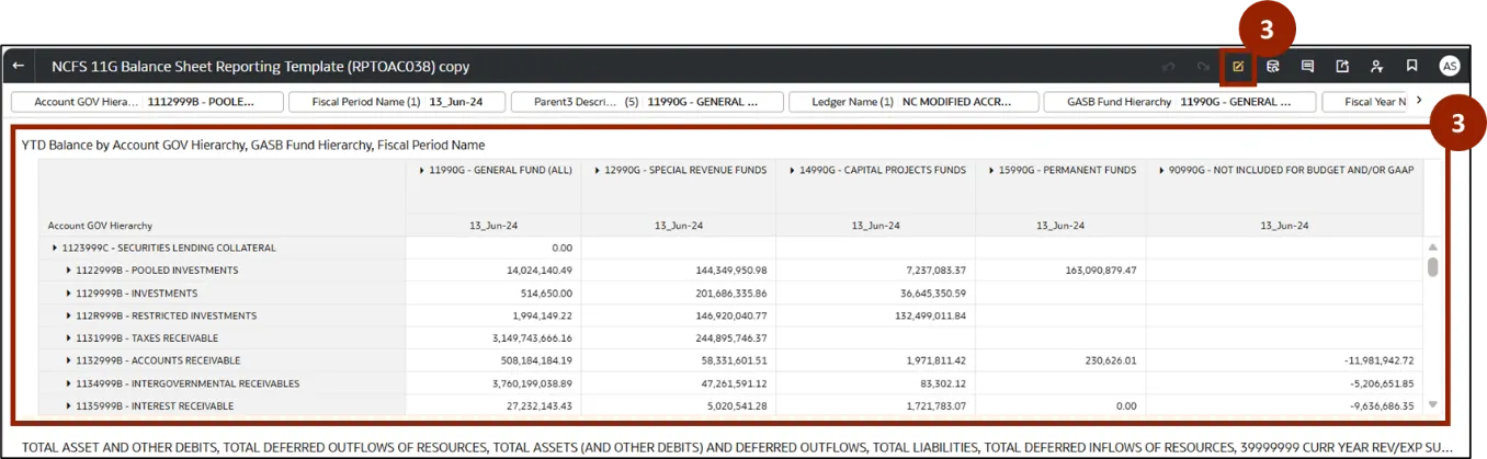
Step 4. The report opens in edit mode. The user can perform the required analysis in the report.
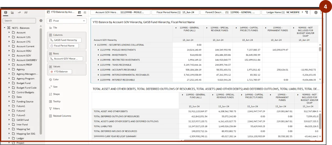
Note: Users can follow the steps in Manipulating 11G Balance Sheet Report to perform the analysis in this example, as demonstrated in Course_vILT_OAC for NCFS 2_20251118.
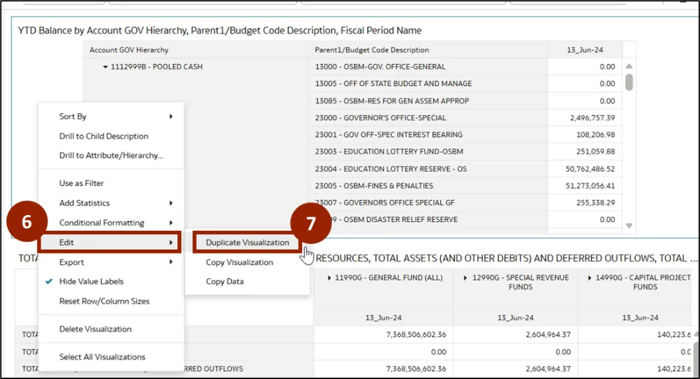
Step 5. Once the analysis is complete, right-click anywhere in the report window.
Step 6. A pop-up menu appears. Select Edit.
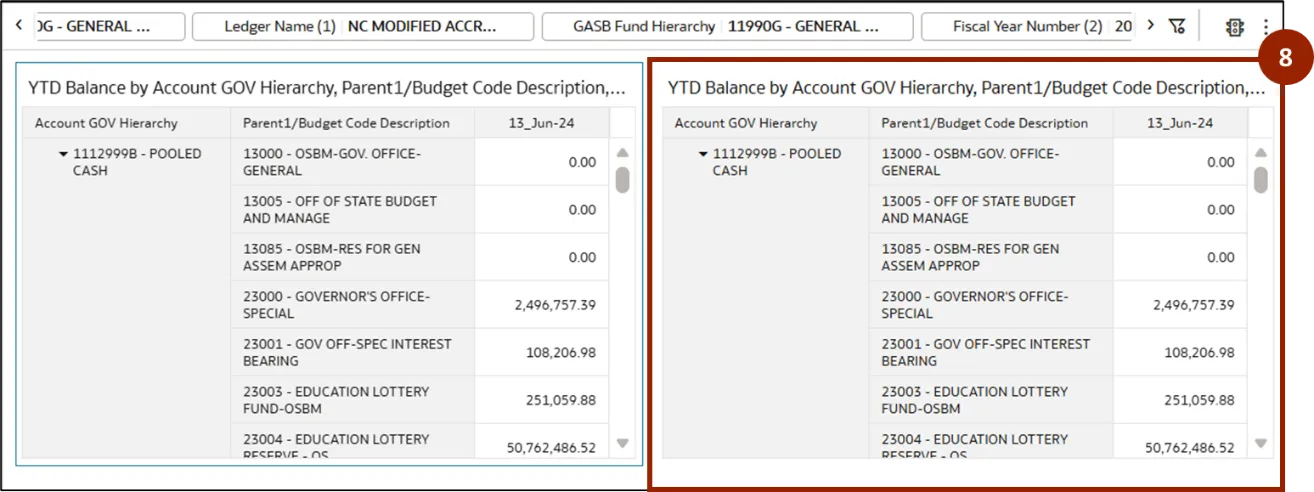
Step 7. Another menu appears, select Duplicate Visualization.
Step 8. The duplicate report will be created to the right or below the window.
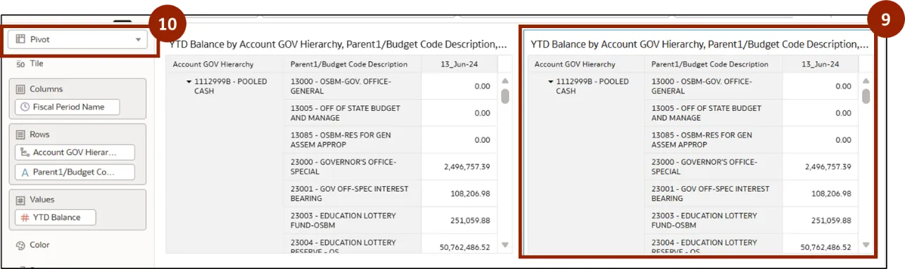
Step 9. Select the duplicate window.
Step 10. Click Pivot drop-down menu.
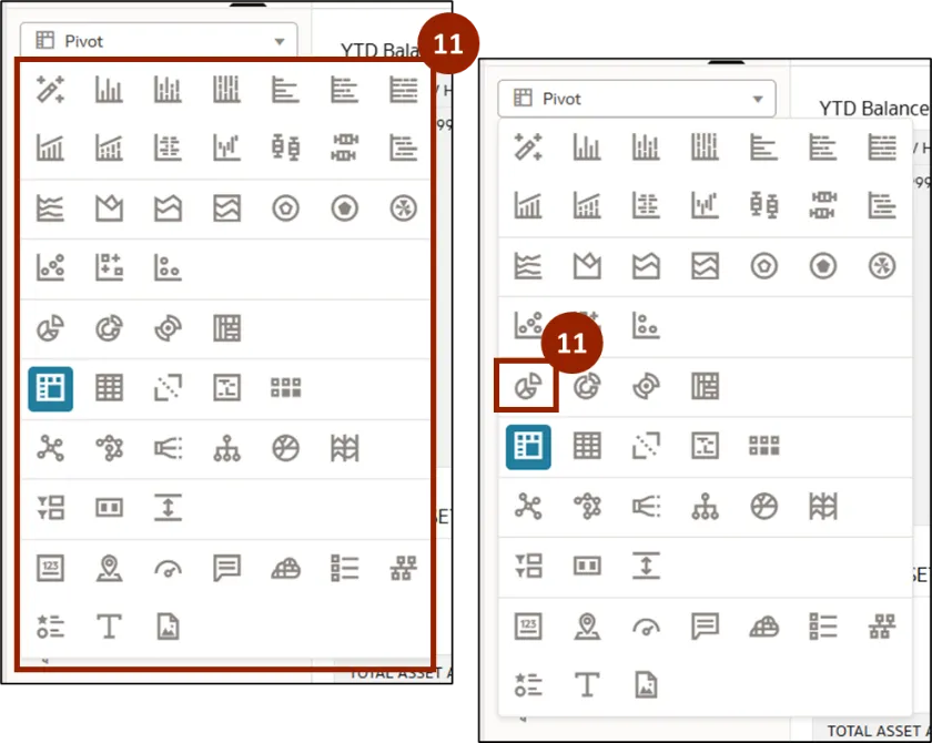
Step 11. A drop-down menu appears, displaying all available visualization options. The user can select the desired option according to their requirements. To display the data as a pie chart, click the Pie icon in this menu.
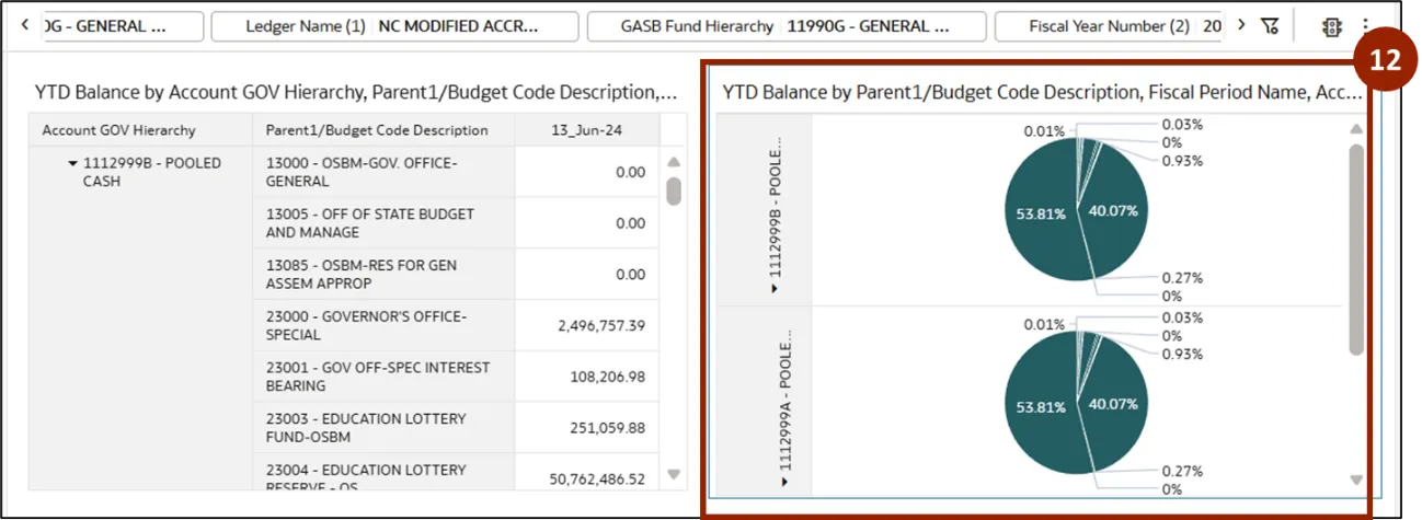
Step 12. A pie chart visualization is now displayed for each Account GOV hierarchy.
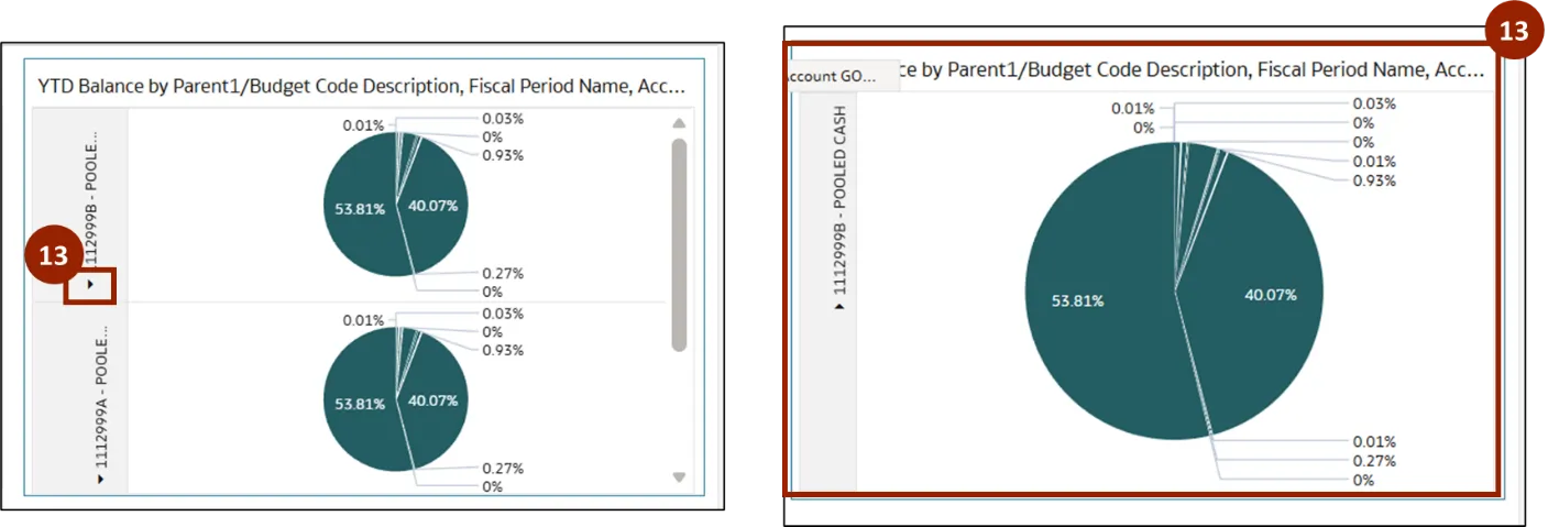
Step 13. To view the pie chart for Pooled Cash, click the Caret icon next to the hierarchy parent. This action will close the expanded hierarchy view and display the pie chart for Pooled Cash.
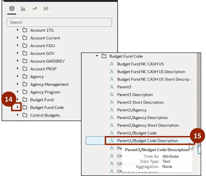
Step 14. Navigate to subject area section, click the Caret icon next to Budget Fund Code.
Step 15. Select and hold Parent1/Budget Code Description.
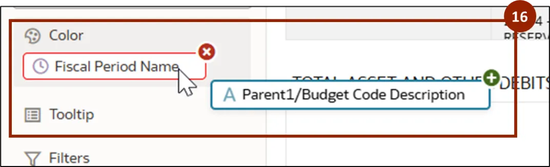
Step 16. Drag Parent1/Budget Code Description and drop it onto the Color section, replacing the existing color field.
Step 17. The pie chart now displays the budget code distribution for the selected Pooled Cash account hierarchy, along with a budget code legend for reference.
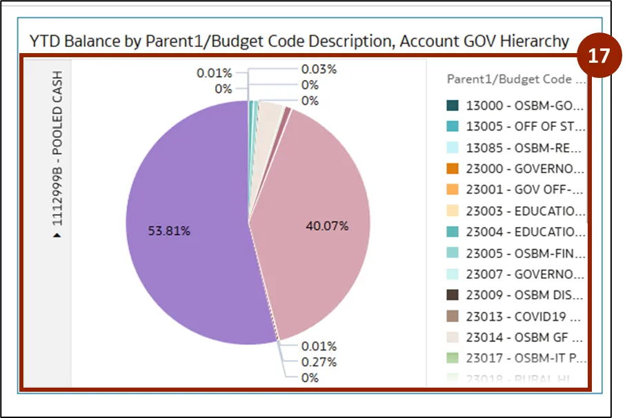
Note: The user can adjust the filters available at the top of the report as needed to update the visualization accordingly.
Wrap-Up
NCFS users can add visualization using the steps above. By following these steps, users can turn raw data into interactive visualizations—such as pie charts and bar graphs—that deliver actionable insights.
Additional Resources
- Virtual Instructor Led Training (vILT)